By drawing inspiration from the rich themes and narratives associated with various amusement park rides, we’ve curated unique designs that truly stand out. Available on Redbubble, our distinctive artworks provide theme park enthusiasts with a fresh and unique alternative to conventional merchandise.
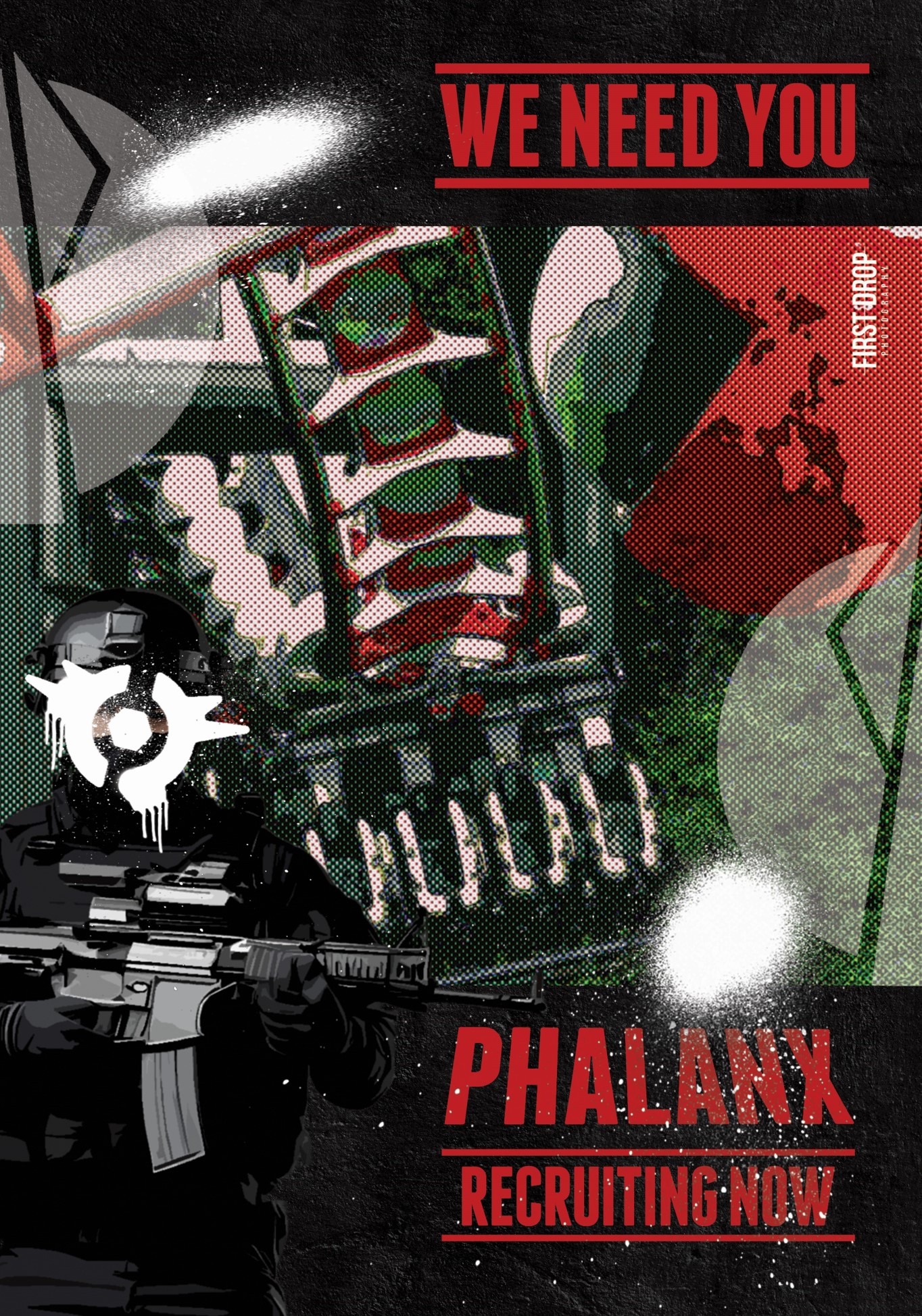
Phalanx Recruiting Now
As the highly anticipated Nemesis Reborn debuted, we had inspiration to create a bold recruitment poster for the fictional organisation, ‘Phalanx’. At the heart of the poster lies a Phalanx soldier, clad in full gear, standing resolute against the looming presence of Nemesis. Bold and commanding typography conveys a sense of urgency and rallies viewers to action, reminiscent of the messaging from traditional military recruitment posters. The poster’s aesthetic is raw and gritty, reflecting a tone of seriousness and intensity. Additionally, elements from the “Seek the Truth” campaign, used by the resort’s marketing team, are subtly incorporated, adding depth and resonance to the design.
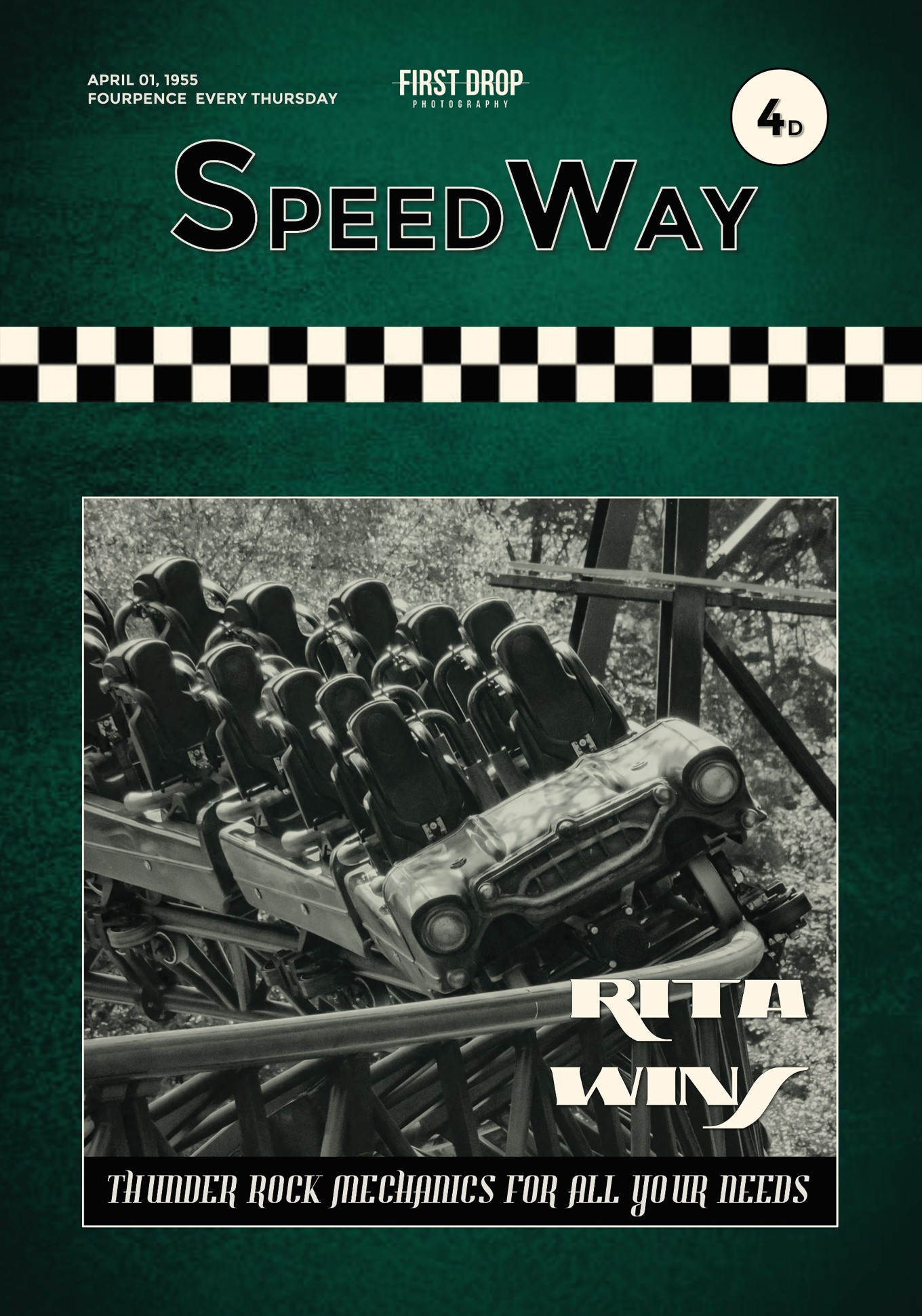
Rita: Speedway
Drawing inspiration from vintage motorsport magazines of the 1950s, this design encapsulates a nostalgic aesthetic. Initially, a different image of Rita was used in the design process. However, upon completion, it became apparent that it didn’t align with the desired sense of nostalgia. Studying 1950s magazines, it was noted that Ferodo Brakes were frequently advertised on the front covers. Nevertheless, for this design, we opted against this route. Instead, we paid homage to Thunder Rock by incorporating a subtle black bar beneath the image.
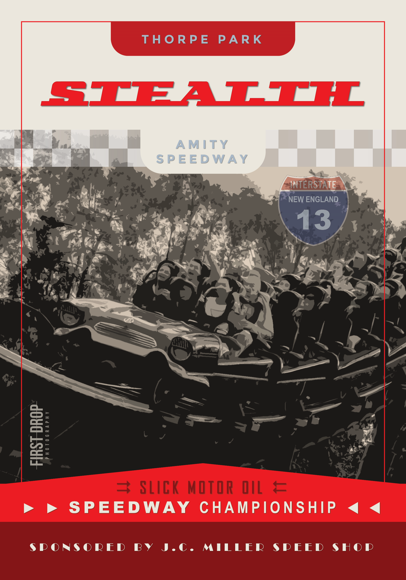
Stealth
Transport yourself back to the 1950s with this retro design. Carefully selected fonts, phrases, and colours echo the era and ride theming found within the area. The main image is tinted sepia to evoke a sense of age and nostalgia. Initially, a different image of Stealth diving down was used, but it appeared unnatural within the design. Consequently, a more horizontal shot of Stealth was applied, captured just as it exhilaratingly exited the dive!
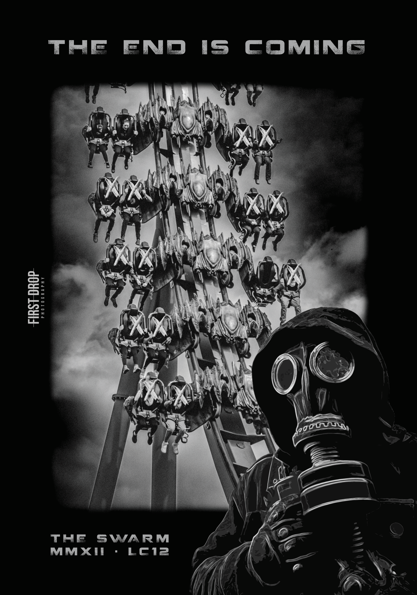
The End is Coming
Amidst a post-apocalyptic setting, Thorpe Park finds itself plagued by an aerial alien force known as The Swarm. To express a darker ambiance, we imagined a black-and-white theme, interrupted by the presence of an enigmatic figure wearing a gas mask and hoodie. Are they a civilian caught in the chaos, a member of a resistance movement, or perhaps a military operative? In the background, The Swarm hurtles down its initial descent against a backdrop of ominous clouds, each abducted passenger marked off as a casualty of the alien onslaught.
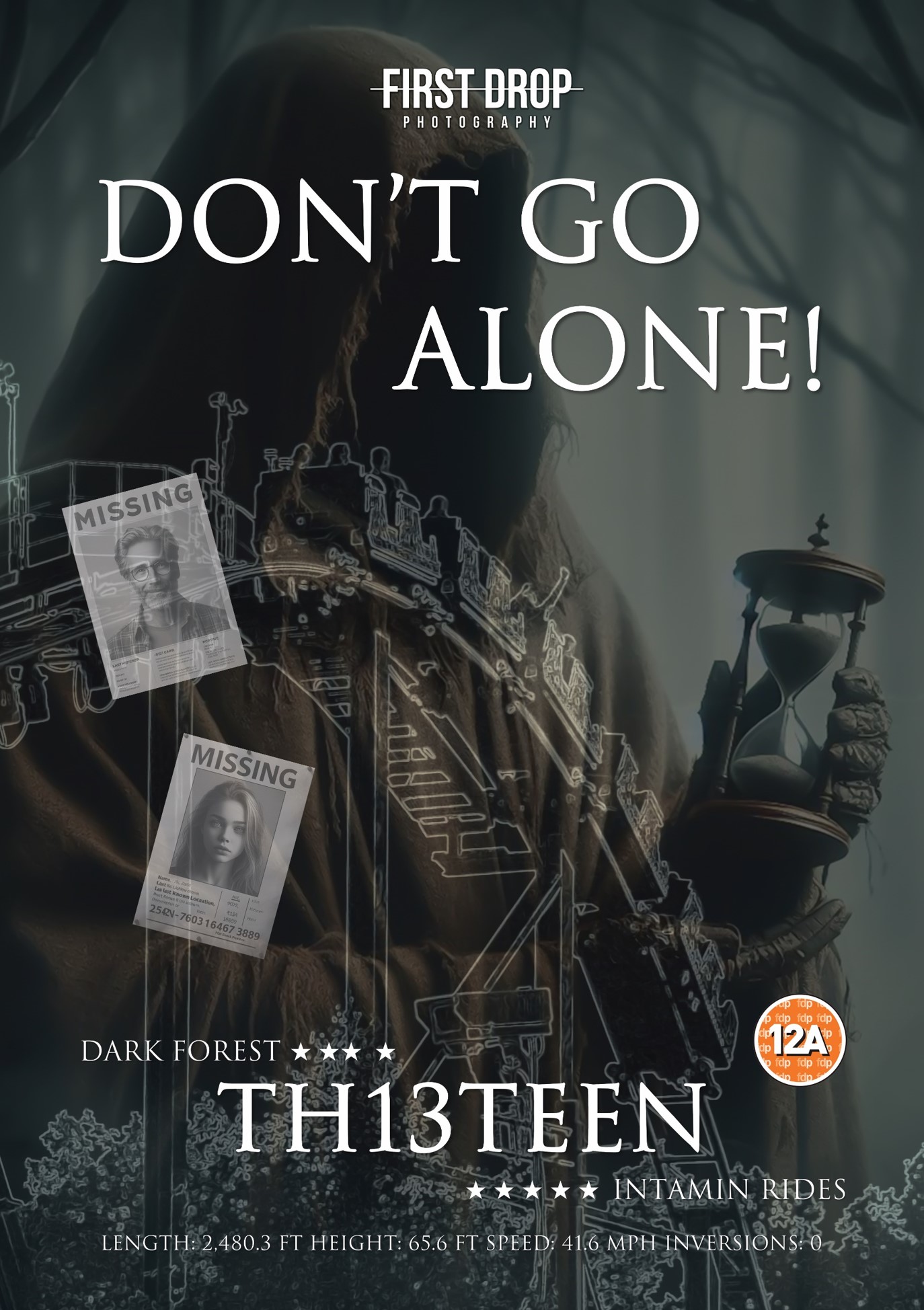
Don’t Go Alone
Out of all the designs, the “Don’t Go Alone” design underwent the most significant development during its creation process. Originally, the image primarily featured trees to enhance the forest’s darkness. However, we opted to merge one of the resort’s main myths by including a Wraith figure in the background. Holding a timer and surrounded by missing posters, it injects a sense of mystery. Has the Dark Forest consumed them? Did the Wraith lure them into a trap?
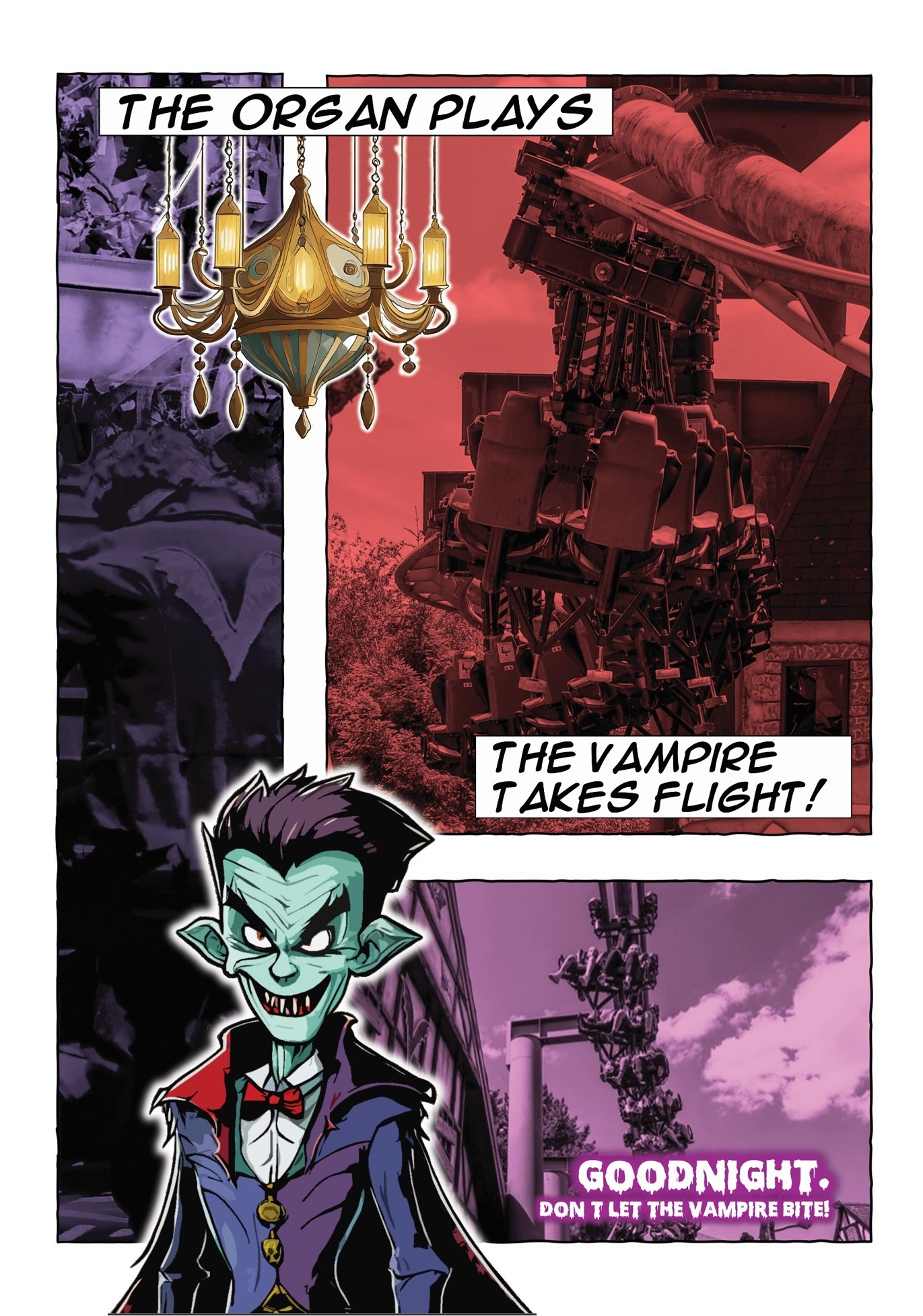
Goodnight. Don’t let the Vampire Bite
Given that The Vampire is primarily aimed at families, it was crucial to avoid any dark overtones in the design, which could easily evoke the Transylvanian and vampire horror theme. A considerable amount of thought was put into opting for a cartoon comic strip style that would appeal to both young and old without conveying any sense of threat. Three images, shaded in reds and purples, were accompanied by a specially designed cartoon vampire outlined in white, while a chandelier was included above, cleverly referencing the original theming once present in the station. To round off the look, cartoon fonts and text boxes were seamlessly incorporated.