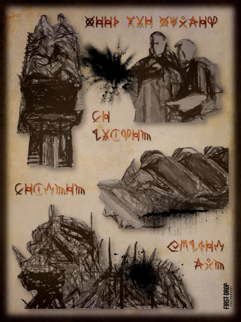
Wicker Man
Using numerous images of Wicker Man from our library, a sketch effect was applied to each filter to give the impression they were hand drawn – fitting in perfectly with the idea that the Beornen rejects the use of modern technology. Those familiar with the Beornen’s ruins will be able to work out what words adorn the poster, but for those who are not; “Feed the Flames”, “Be Chosen”, “Beornen”, and “Wicker Man” are spelled out.
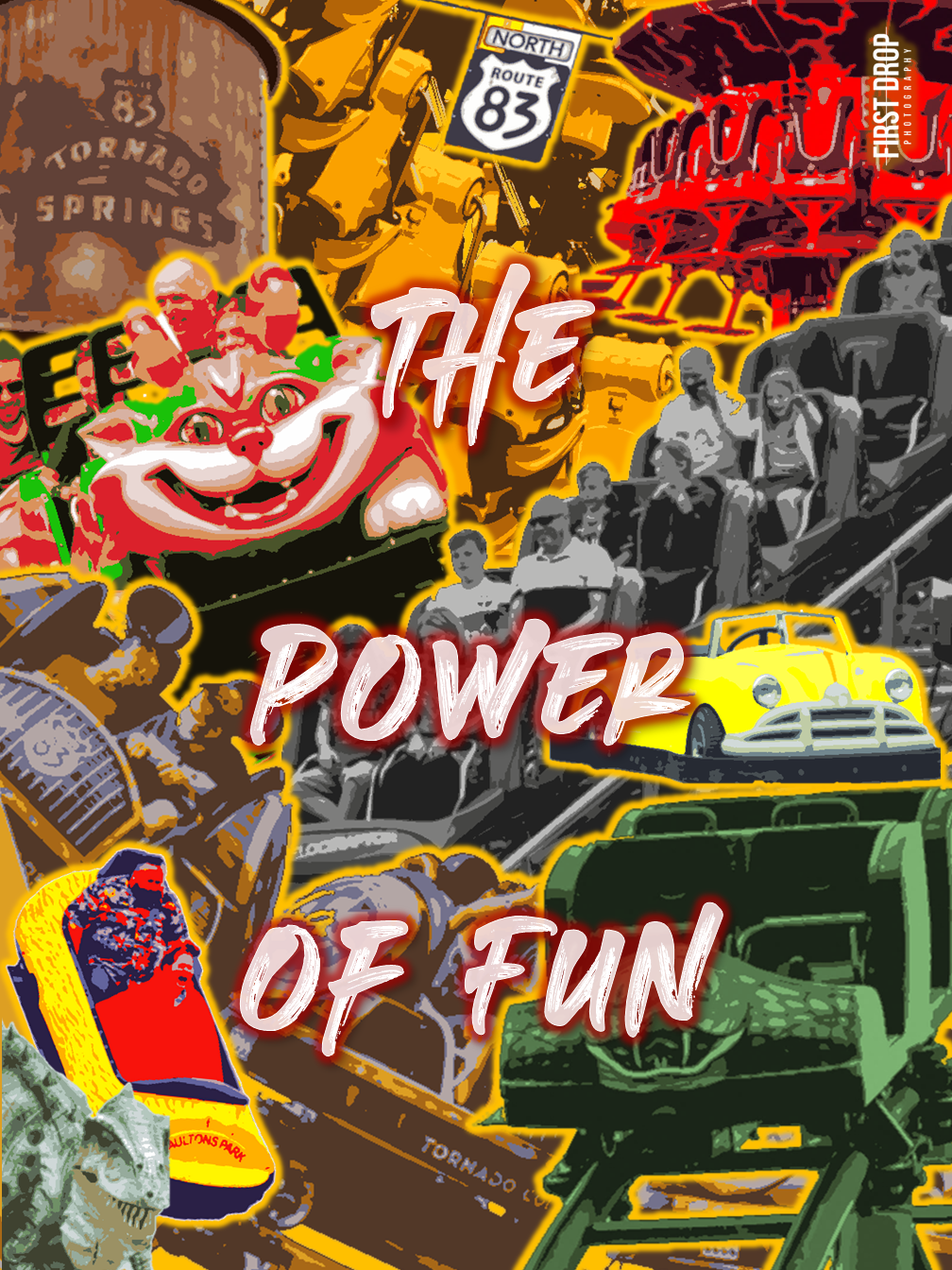
The Power of Fun
The Power of Fun is a montage of all things Paulton. From Storm Chaser to the Raging River Ride Log Flume, this retro themed poster encapsulates all things fun. The poster is bright and would easily capture the attention of those passing by, should it be on display.
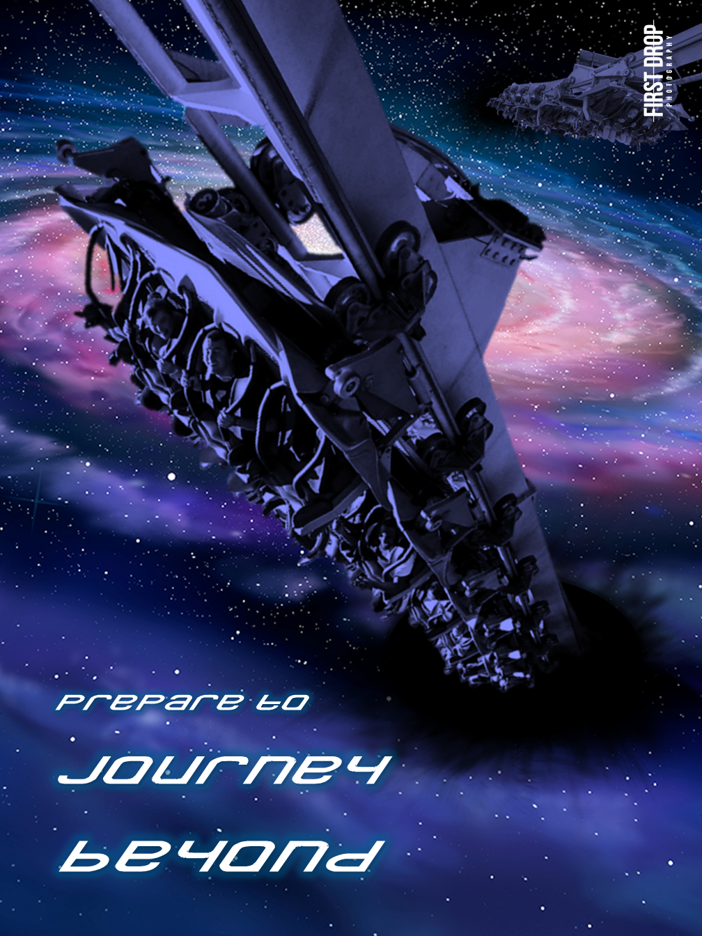
Prepare to Journey Beyond
In this minimalist poster design, Galactica is depicted as venturing through the portal located in Forbidden Valley. The visual focuses on Galactica’s emergence from a black hole, transitioning into the vast expanse of deep space. Initially, the design included various spacecraft and robots scattered across the scene, but they were eventually removed to enhance the poster’s aesthetic. Enthusiasts of roller coasters might recognise the clever fusion of the slogans “Prepare for Air” and “Journey Beyond” into the combined phrase “Prepare to Journey Beyond.” This homage is accentuated by the use of the distinctive typeface formerly associated with Air.
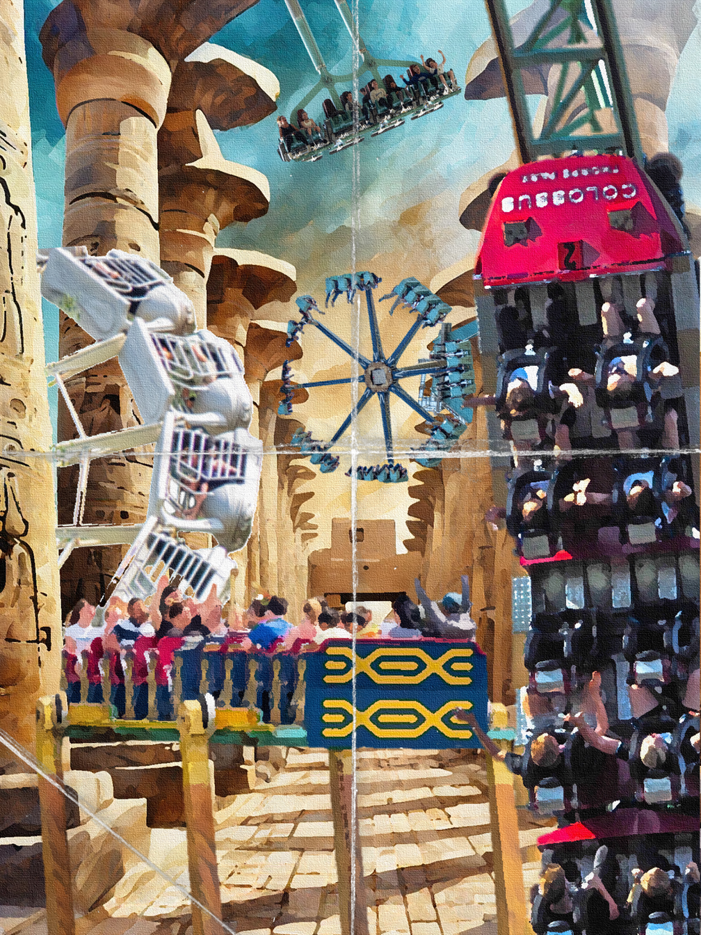
The Lost City
With this poster, the main focus was to make the Lost City theme more apparent. The poster uses an ancient temple at its base with photos we have taken of the area’s rides incorporated throughout. To add a sense of adventure, expedition and history, a paper fold effect was added on top of the image. It reminds me of something Indiana Jones would have in his pocket in reference to his final destination, or travel plan.
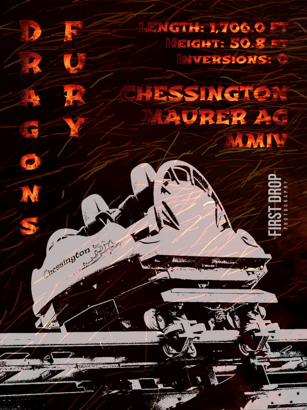
Dragons Fury
At the outset, this design began in a basic fashion. It was simplistic and, frankly, quite uninspiring! The font lacked appeal, and the theme was ambiguous. However, through some refinement, the essence of a Chinese dragon was infused into the design by incorporating fiery text and airborne embers. The train stands out prominently, with the poster displaying ride statistics that unmistakably signify its status as an exhilarating attraction!
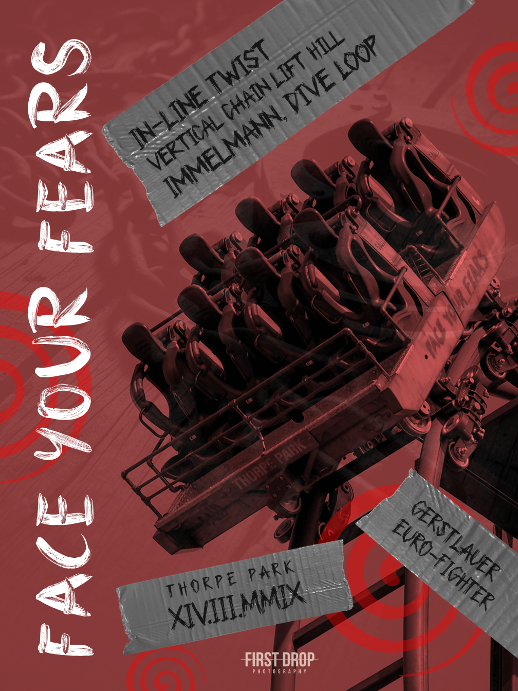
Face Your Fears
Inspired by the phrase adorning the side of Saw: The Ride’s trains, “Face Your Fears” takes centre stage in this design. The font mirrors hand-painted text, lending a raw quality to the graphic. The addition of gaffer tape (absent in the original design) evokes Jigsaw’s presence, while the iconic red spirals are synonymous with the film franchise. The use of red also echoes the colour scheme of the logo and conveys a sense of blood. Behind the image of Saw hurtling down its beyond-vertical drop, shackles subtly emerge, further enhancing the design’s ominous atmosphere.
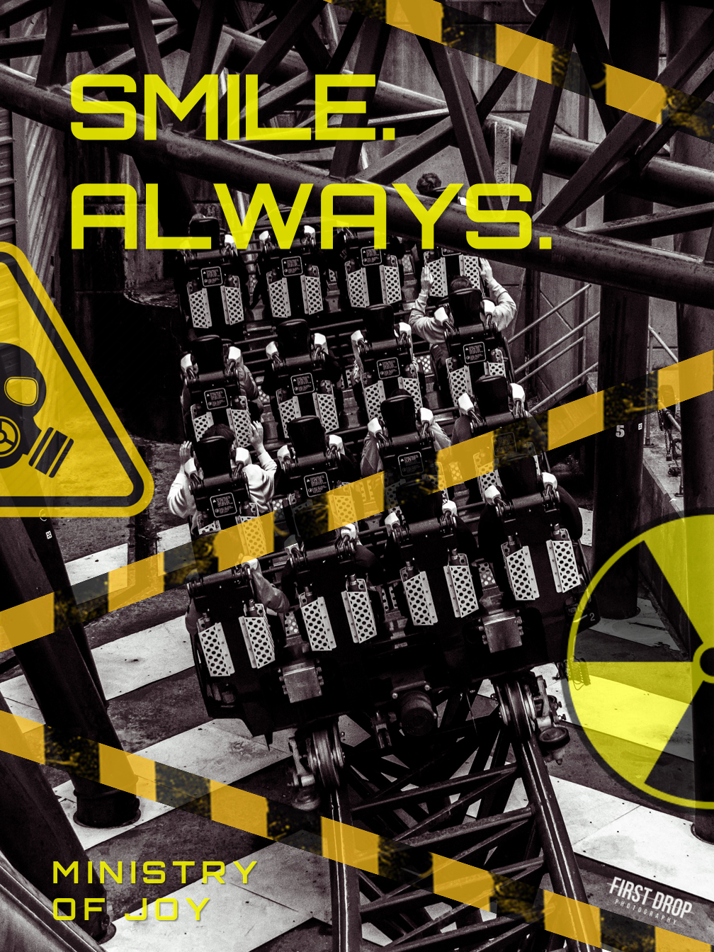
Smile. Always.
Inspired by the Ministry of Joy’s innovative approaches to spreading happiness, the base colours of black and yellow were chosen to complement the ride’s overall colour scheme. The prominent use of yellow tones, evident in warning signs and hazard tape, further underscores the industrial theme of this coaster. One might wonder: are the hazard signs provided for our safety, or do they hint at the thrills that await within? The font used also corresponds with that used on the attraction.
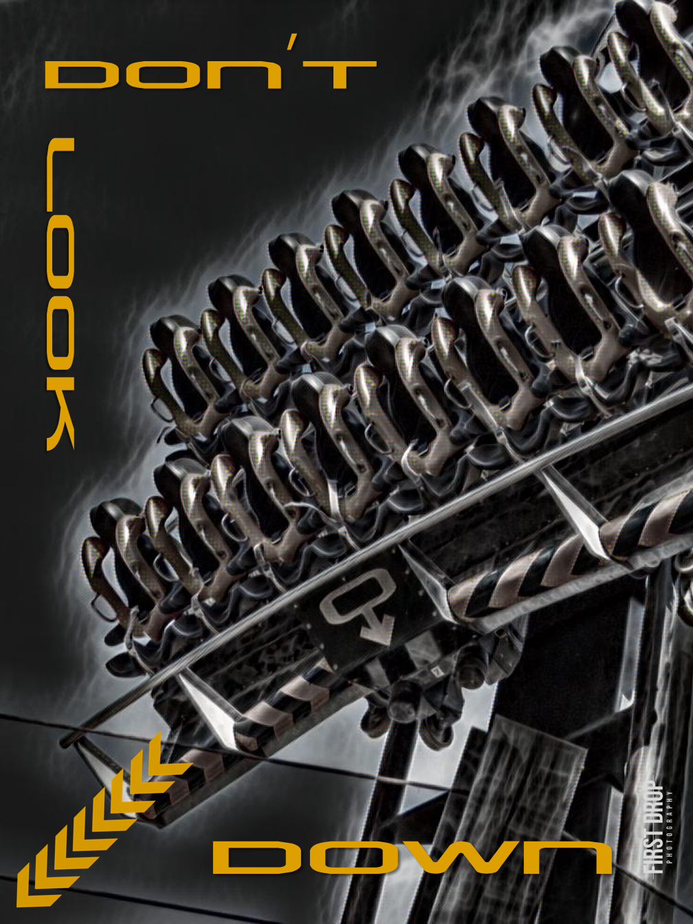
Don’t Look Down
To capture the essence of Oblivion’s debut in 1998, we aimed to capture the atmosphere of the TV advertisement aired during that era with this design. Infusing a dark tone into the image, we highlighted the main catchphrase in orange, using a font reminiscent of the ride’s branding. Fortunately, the design captures an industrial essence, as intended, staying true to the era it represents.
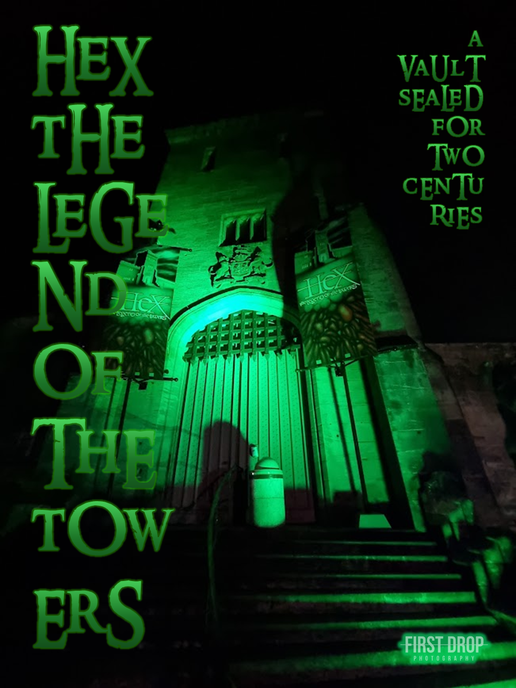
A Vault Sealed for Two Centuries
The entrance image of Hex remained untouched for this design, as its eerie green glow effectively conveyed the mysterious allure of the ride. Taking an unconventional approach, we opted to break up the text lines, allowing them to overflow. This choice was deliberate, aiming to reinforce the disorienting nature of the ride. The line “A Vault Sealed for Two Centuries” adds an air of curiosity, inviting speculation about the secrets hidden within.
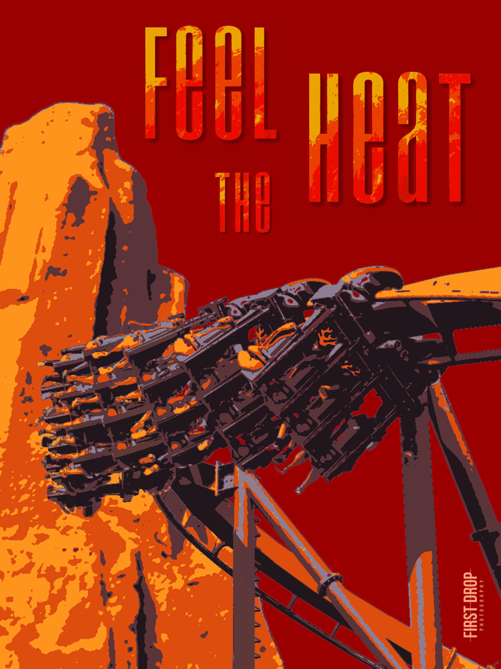
Feel The Heat
Embracing a timeless and straightforward design, Nemesis Inferno at Thorpe Park stands in stark contrast against the rugged rock formation and plain background. The font mirrors the style featured in the Nemesis Inferno logo, while the phrase “Feel the Heat” further accentuates the intense and fiery essence of the ride.